Handsome Hybrid – Wilson School of Design in Canadian Architect
Article content
Click here to view Canadian Architect
by D’Arcy Jones
John Coltrane said his saxophone playing was like jumping into the middle of a sentence. Similarly, Kwantlen Polytechnic University’s new Wilson School of Design in Richmond is pleasingly jarring inside. Beyond the precise and planar entrance, the interior is a bare composition of glass, concrete, wood and white drywall.
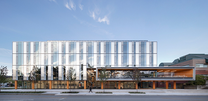
On the main façade, a cantilevered box houses an outdoor patio and doubles as an entrance canopy.
Designed by KPMB Architects and Public Architecture + Communication, the new school slots into an L-shaped void between two arms of a brick collegiate building from the 1990s, infilling a former parking lot. Its footprint is close enough to its neighbour to highlight how the two buildings aren’t on speaking terms materially, but is far enough away to create a well-proportioned green courtyard between them. Projecting an urban attitude in a mostly suburban neighbourhood, the school is already a campus gatehouse. It welcomes students from the nearby (and also recently opened) Lansdowne Skytrain station, enticing them away from the campus’s formal entry around the corner. While the building’s dominant façade currently stares down acres of shopping mall parking, an urban-village-style development is coming soon, which will give the school a real sparring partner.
A slick glass skin encloses the new Wilson School of Design, while a glulam wood structure gives it the informal feel of a repurposed warehouse.
Richmond is a comfortably flat landscape of malls, mega-houses and Maseratis. Once called Lulu Island, the triangular municipality started as sprawling wetlands. The new school’s construction could not start until the site was densified and pre-loaded with gravel to solidify its delta silt, for over $1 million. To control that cost, building lightly was important. The result is a post-and-beam wood structure with steel decking on a concrete raft slab, compared to a ship by the architects. To me, it is maybe more like a plaid tent with a classical tripartite silhouette. The building is like a tailored suit on the outside, but feels like Jeans Friday inside.
The building’s mass timber legs poke out from under its taut skirt, so they were finished with a Sikkens stain to prevent rotting or fading. The wood looks pencil-yellow—fitting for a school focused on process and potential. The tinted wood highlights the structure’s syncopated rhythm, which figuratively glues the school together by exposing some wood structure in almost every space. The timber is secretive about its detailing, with connections that appear boltless, hidden by a click-together assembly.
The Wilson School of Design’s central atrium includes views to a student lounge and studios on the second level.
Surprisingly, the structure is not made from locally grown timber. It is glue-laminated spruce from somewhere in Europe, via Austria. The cheapest bidder with the shortest lead time is chosen on projects that spend any public dollars. This feels good to taxpayers, but in this case the lost opportunity should be a nudge to British Columbia’s value-added wood industries to stay sharp. A country of forests ought to be an international leader when it comes to anything to do with wood.
The $36-million building for 500 students was paid for by a trio of funders. A third of the cost came from the British Columbia Government and another third was chipped in by Kwantlen Polytechnic University. Shannon and Chip Wilson of the Lululemon Athletica and Kit + Ace empires donated most of the last third. As local technical apparel pioneers, the Wilsons wanted to support the university that trains their best hires. Having a 5,600-square-metre building and a design school named in your honour has a certain cachet—although the design students are the real winners. They have moved from the school’s previous cramped quarters to a new headquarters that could just as easily host a tech startup, a casual-yet-serious design firm, or a future School of Thought.
Connection details between columns and beams are concealed by a click-together assembly of the school’s engineered wood structure.
The building’s stern but attractive form fits six faculties—graphic design, fashion design, product design, technical apparel design, fashion marketing, and interior design—under a single roof. The program is all about overlap. A product designer melting plastic can see a fashion designer toiling on a sewing machine. An interior designer could help the technical apparel designer fix the jammed laser cutter. Graphic designers might print posters beside a professor testing fabric dyes, while both of them hear someone sawing wood in the shop. This controlled chaos is visible to the greater campus and community. The interior is furnished with white rolling work desks, white smart boards and moveable seating—a spare backdrop that highlights students and their projects. The new school is intended to be a busy beehive.
As an architect who started out in house design, I am biased, but I believe that whether a building is for a family, a group or a broader community to share, it should be influenced by history’s oldest residential traditions. Often, these traditions get distorted or abandoned as projects grow, creating big architecture that can be insensitive because it does not resemble any kind of familiar space. If an environment is unrelatable, it kills any feelings of well-being.
Cascading stairs invite students up into the heart of the Wilson School of Design, and across a link bridging to the campus’s main buidling. Adjacent seating provides a place to pause in the midst of the bustle.
The Wilson School of Design taps into design principles that predate modernism. It feels like a transformed manor house, with a secure sense of prospect and refuge, protected entries that spatially squeeze, free and controlled movement, well-tempered light and air, a clear and diverse hierarchy of spaces, and a central gathering space that nurtures the smaller spaces. These essentially domestic qualities are universal. Expressed within this new school, they allow students to comfortably inhabit the fluid interior spaces in a very non-institutional way.
During recent visits, a few finicky things jumped out at me. The top floor’s public exhibition space that scoots a few feet past the main building appears slightly tentative. It was bolder and more confident in an earlier rendered iteration, before value engineering scaled it back. The use of black on the exterior at the base and top adds another tone to a palette that already seems complete without it. Inside, wood ceiling slats hide piping that, if left visible, would not have detracted from the whole.
Full-height windows allow for plentiful natural light in an upper-floor sewing lab. Workshops, computer labs, design studios and crit spaces are all located in daylit areas with operable windows. Photo by Andrew Latreille.
The Wilson School of Design has a smoothly ambiguous personality. Robert Venturi’s concept of Both-And feels freshly applicable to the building and its architects’ design process. This is subtly so when a cantilevered wood-lined volume functions as a coffee shop patio and an entrance canopy. It is unmistakably so when the school’s flush glass box, scientifically tuned for solar gain, wraps around its pre-industrial-looking timber frame. The school’s even-handed architecture does not feel traditional, but also does not feel uncompromisingly modern. Rigour has produced a handsome hybrid.
Related News
Downsview Framework Plan wins National Urban Design Award
April 17, 2024)
)
)